
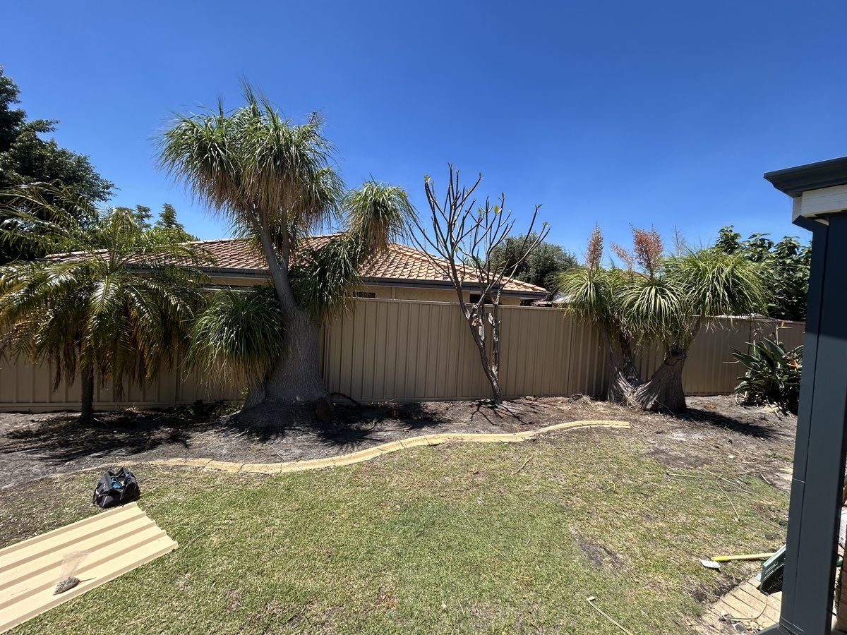
A new fence can change how an entire property feels from the street, but it also needs to sit comfortably beside your home for years to come. Choosing the right Colorbond fence colours is about more than picking a shade you like on a brochure. Perth light, surrounding materials, garden plans, boundary position and the level of privacy you want all influence the best result.
Colorbond steel fencing is a practical choice for homes, investment properties and commercial sites across Perth, Bunbury and Busselton because it is durable, private and low-maintenance. The colour is the design decision that turns a functional boundary into a finish that complements the property.
Start with the fixed colours around your property
The most reliable place to begin is with the elements that are unlikely to change: your roof, brickwork, render, driveway, paving and window frames. Your fence does not have to match every one of them exactly. In fact, an exact match can sometimes make the exterior look flat. It should, however, belong to the same overall colour family.
A home with cream brick, sandstone paving or warm roof tiles generally works well with earthy, muted fence colours. Think soft greens, warm greys, browns and beige-based tones. These colours help the boundary settle into the landscape rather than becoming the first thing people notice.
Cooler finishes suit a different approach. If your home has white render, charcoal roofing, concrete paving or black-framed windows, a contemporary grey or deep charcoal fence can create a clean, deliberate look. Dark fencing is especially effective with modern architecture, but it needs to be balanced with the size of the yard and the amount of sunlight it receives.
For homes with mixed materials, choose the dominant visual feature. A rendered front elevation with a dark roof, for example, may call for a fence that references the roof rather than the smaller brick sections along the side of the house.
Light changes how Colorbond fence colours look
A colour sample viewed indoors is not the same colour you will see on a long boundary fence at two o'clock on a clear Perth afternoon. Strong sun can make pale colours appear brighter and can bring out warm or cool undertones that were not obvious at first glance. Shadows from neighbouring homes, patios and established trees can make a dark fence look deeper again.
This is why samples should be viewed outside, beside the home and at different times of day. Hold the sample near the roofline, paving and garden beds, not just against a white wall. If the fence will run down a narrow side access, look at that area too. A shade that looks refined in an open front yard can feel much heavier in a shaded passage.
Coastal and semi-rural properties add another consideration. Bright open light in places such as Busselton can suit natural, softened shades that work with sand, limestone and native planting. In established Perth suburbs, where lots may have mature gardens and varied building materials, neutral colours often provide the most flexible long-term choice.
Choose the mood before choosing the shade
Most fence colour decisions become easier when you decide what you want the boundary to do visually. A fence can disappear into the garden, create contrast around the home, or provide a crisp frame for a modern exterior.
If privacy is the priority, a deeper colour can make the fence line feel solid and enclosed. Dark grey, charcoal and dark green tones can also make foliage stand out, which is a strong option for rear gardens, pool surrounds and homes with established landscaping. The trade-off is that dark colours absorb more heat and can make a compact courtyard feel more enclosed if there is limited greenery or natural light.
Lighter neutral colours can make small yards feel more open and tend to reflect light into shaded areas. They are often a sensible choice for side boundaries close to outdoor living spaces. The compromise is that pale fencing may show dust, splash marks or garden residue sooner in high-traffic areas, even though Colorbond fencing remains straightforward to maintain.
Mid-tone greys, soft greens and muted browns are popular because they offer a practical middle ground. They conceal everyday marks better than very light shades, do not dominate the garden like a very dark fence can, and work across a broad range of home styles.
Match the fence to where it will be installed
Not every boundary needs to make the same visual statement. The front fence, side boundary and rear fence perform different jobs, and colour can help each area do that job well.
At the front of a property, the fence contributes directly to street appeal. A shade that works with the roof, letterbox, gate and front garden creates a neat first impression. If you are adding a pedestrian gate or vehicle gate, consider whether you want it to blend into the fence or stand out as a feature. Matching the fence colour gives a consistent, low-fuss look, while a darker gate frame or feature screening can add definition.
Along side boundaries, privacy and visual comfort usually matter more than statement design. Choose a colour that looks good from your patio, kitchen window and outdoor entertaining area. A calm neutral tone is often the safest option, particularly where neighbouring properties are close.
For rear boundaries, garden compatibility matters most. Green, grey and natural earth tones provide an effective backdrop for lawn, planting beds and timber decks. If you are planning landscaping later, a versatile neutral fence will give you more freedom with plant and paving choices.
Popular directions for Perth homes
There is no single best colour, but several approaches consistently work well across local property styles:
- Warm neutrals suit limestone, cream brick, terracotta details and native gardens. They bring a relaxed finish without looking dated.
- Mid and dark greys pair well with contemporary homes, exposed aggregate driveways, pale render and black or Monument-style roof details.
- Deep greens work particularly well where greenery is a major feature, helping the boundary recede behind hedges, lawn and garden beds.
- Crisp light tones can lift coastal, Hamptons-inspired and rendered homes, especially when balanced with darker architectural details.
These are starting points, not rules. A dark fence can look excellent beside warm brick if the roof, paving or gate hardware provides a visual link. Likewise, a soft neutral can work with a modern home when the goal is to soften a hard-edged exterior.
Consider contrast carefully
Contrast gives a fence presence, but too much contrast can make a boundary look disconnected from the house. A very dark fence against a pale home creates a bold, contemporary edge. It can be effective on wide blocks, behind structured landscaping or alongside black aluminium slats and modern gates.
On a smaller suburban block, lower contrast is often more forgiving. Choosing a fence colour close to the roof, driveway or external trim helps the property feel wider and more settled. This can also be a sound choice for investment properties, where a neutral exterior is likely to appeal to a wider range of tenants and future buyers.
If you want a feature without committing to a high-contrast full boundary, combine Colorbond fencing with a considered gate, aluminium slat screen or perforated panel near the entry. The main fence can remain practical and private while the front of the property carries more of the design detail.
Do not forget the practical details
Colour should work with the full fencing system, including posts, rails, capping, gates and any adjoining screening. A consistent finish usually looks cleaner, especially on long boundaries. Where a fence meets existing retaining walls, masonry piers or timber structures, inspect those junctions before making a final choice. The wrong tone can make an otherwise tidy installation look pieced together.
It is also worth thinking ahead. Will you repaint the home, replace the roof, install a pool area or build a new patio in the next few years? If major exterior changes are planned, choose a flexible fence colour that will still work once those projects are complete. Mid-tone neutrals are often a dependable option when the final landscaping or façade palette is still evolving.
For strata, commercial and development projects, consistency across multiple boundaries may be more valuable than finding an unusual feature shade. A colour that is durable-looking, broadly appealing and easy to coordinate with gates and access points supports a professional finish.
Get the colour decision right before installation
A fence is a long-term part of your property, so take the time to compare samples in the actual installation area. Look at them in direct sun and shade, against fixed building materials and from both inside and outside the boundary. Ask whether the colour will still suit the home if the garden becomes fuller, the deck is updated or the property is sold in five years.
Perth Fence Pro can help narrow down Colorbond fence colours based on your home style, boundary layout and the look you want to achieve. The strongest choice is usually not the trendiest shade. It is the one that gives your property privacy and security while making the whole exterior feel considered, durable and easy to live with.